
Friday, 18 August 2017
Thursday, 17 August 2017
Recognising Gestalt Principles in MC Escher's And Luba Lukova's works
MC Escher
Luba Lukova
 |
| http://www.mcescher.com/gallery/switzerland-belgium/metamorphosis-i/ |
- Similarity. The character on the right is placed at different angles and different shades to move from the character into cubes, which turn into buildings.
- Continuation. With the flow if the buildings the eye is drawn from the from the either side of the image. From the character on the right to the detailed buildings on the left, and vice versa.
- Proximity. The cubes and the character is placed closed together to create a group/pattern
 |
| http://www.artnet.com/artists/m-c-escher/ |
- Similarity. The spider and frog looking things are similar to each other.
- Proximity. The spider and frog things are placed close together.
- Closure. As the white frog things get less details as the go from black background to being fully white. The spider things do the same thing but doing from the white background the being fully black.
 |
| http://www.mcescher.com/gallery/switzerland-belgium/metamorphosis-i/ |
- Reification. The image has a 3 dimensional aspect which makes the eye/mind see something that isn't actually there.
- Continuation. The spirals in the image draw the eye to follow the spiral
Luba Lukova
 |
| http://criterioncompletion.com/luba-lukova-2/ |
- Similarity. There are four similar outlines of the girl.
 |
| http://qns.com/story/2014/05/15/looking-into-the-artwork-of-lic-artist-luba-lukova/ |
- Figure and Ground. The reflections in the saxophone are not only reflections but people.
- Similarity. The buttons on the saxophone are similar to each other.
 |
| http://www.graphicart-news.com/the-distinctive-artist-luba-lukova-in-graphicart-news/#.WZUAmDOB1Bw |
- Figure and Ground. The people in the image form the letters L.O.V.E. As well as showing what "love" looks like. The 'V' also makes a heart.
- Similarity. The people in the image are all very similar to each other
Friday, 11 August 2017

Colour Theory Pt 1
PRIMARY COLOURS


The primary colours in photography was easy to find. The colours work well as each colour makes each other stand out.
SECONDARY COLOURS


The Secondary colours were. also, easy to find. These colours can look nice together is used well, like in the first to images.
TERTIARY COLOURS


The tertiary colours, I found were harder to find. These colours are resonate against each other and are my favourites. :)
ANALOGOUS COLOURS


Analogous colours were easy to find. The gradience from going from one colour to another works really well and is pleasing to the eye.
COMPLEMENTARY COLOURS


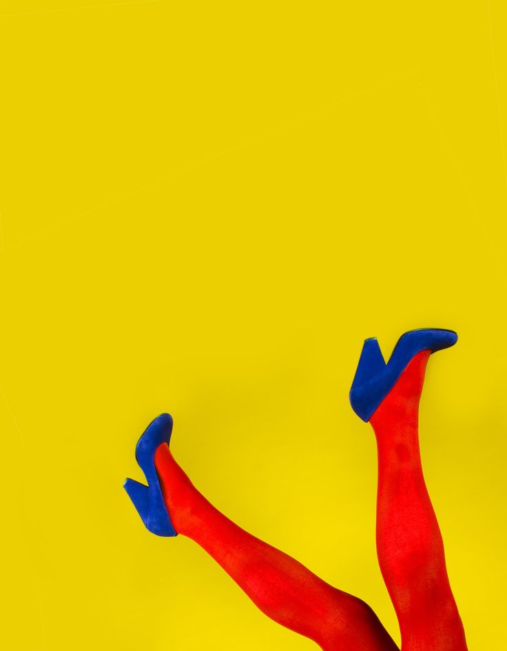
Complimentary colours were easy to find in photography. By using a colour in the background that complements the subject in the image, the subject stands out from the background.
All images are not my own - all rights belong to those who took the images.
They were taken from google images.
Thursday, 3 August 2017

Subscribe to:
Posts (Atom)