Tuesday 26 September 2017

Final Expression Poster

Design is an onion, was inspired by a quote from the movie ‘Shrek’. It gave me the idea of onions have layers, so does the design software. Being an animation student, I immediately thought of onion skin, a tool that animators use to put a frame in the correct position. I also think onions taste pretty good when cooked and desgin, once the project is finished it usually looks pretty good.

My original design idea was to have an onion and peel back the layers in a way that show the process of doing so - having the full onion and the peeled onion with the just a colour linework in the middle, giving movement to the design. This was inspired by one of Luba Lukoba’s works. But that all changed after getting feedback on the idea, I altered the design to have more of the process that is involved in design.

Design can be frustrating and can make you want to cry as you work with layers upon layers of effects and elements and then having to change it all because it’s not working, but the end result usually looks pretty great and communicates what you want to say through the design.
The same goes for onions. You cut an onion and it makes you cry, but once cooked it tastes good.
This is the idea that is in this poster.

I used analogous colours that are similar to onion colours to represent the idea, with a touch of a blue tint for the drops that are dripping from the onion roots. And black as a shadow for the typography to be more readable against the background and the image of the onion.
The font I chose is “Just tell me what”. I chose this font because it is a soft rounded font that fits well with the design of the onion.
The gestalt principles I applied in the design are similarity, proximity and closure.
I placed the onion in a just of centre postion and placed the typography close together and next to the onion to give balance to the work.


Self Expression Poster Process


Draft #1
 I couldn't decide on which colours to use.

Draft #2
I chose the yellow one, because it represents the onion's colour more than the others.


Friday 15 September 2017

Mind Map, Mood Board, Concept


Self-Expression Poster Mind Map


Self-Expression Poster Mood Board


Self-Expression Poster Concept


Friday 8 September 2017

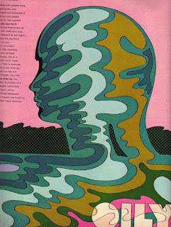
Milton Glaser


This design bring to attention the oil pollution that people have contaminated the oceans 
around the world with.
Glaser uses figure and ground in this design. 
It emphasised the oily water is caused by people.
Glaser uses tertiary colours with a dull intensity within the human shape. 
and a complimentary colour in the background to draw the eye to the human shape.
The design fits into the 'golden section'.


Glaser uses the wild hair as an expression of imagination, ideas, thought that is endless.
Again, Glaser uses figure and ground to bring the attention of the viewer to the contrasting colours of the hair.


This design uses a well known character (Akira) and uses the figure and ground give shape to the character. The designer uses primary colours colours that represent the character in the animations. 
Each piece of hair is like a cable, which represents parts of the story of Akira.


Thursday 17 August 2017

Recognising Gestalt Principles in MC Escher's And Luba Lukova's works

MC Escher
http://www.mcescher.com/gallery/switzerland-belgium/metamorphosis-i/

  • Similarity. The character on the right is placed at different angles and different shades to move from the character into cubes, which turn into buildings.
  • Continuation. With the flow if the buildings the eye is drawn from the from the either side of the image. From the character on the right to the detailed buildings on the left, and vice versa.
  • Proximity. The cubes and the character is placed closed together to create a group/pattern


http://www.artnet.com/artists/m-c-escher/


  •  Similarity. The spider and frog looking things are similar to each other.
  • Proximity. The spider and frog things are placed close together. 
  • Closure.  As the white frog things get less details as the go from black background to being fully white.  The spider things do the same thing but doing from the white background the being fully black.
http://www.mcescher.com/gallery/switzerland-belgium/metamorphosis-i/


  • Reification. The image has a 3 dimensional aspect which makes the eye/mind see something that isn't actually there.
  • Continuation. The spirals in the image draw the eye to follow the spiral


Luba Lukova

http://criterioncompletion.com/luba-lukova-2/

  • Similarity. There are four similar outlines of the girl.


http://qns.com/story/2014/05/15/looking-into-the-artwork-of-lic-artist-luba-lukova/


  • Figure and Ground. The reflections in the saxophone are not only reflections but people. 
  • Similarity. The buttons on the saxophone are similar to each other.
http://www.graphicart-news.com/the-distinctive-artist-luba-lukova-in-graphicart-news/#.WZUAmDOB1Bw


  • Figure and Ground.  The people in the image form the letters L.O.V.E. As well as showing what "love" looks like.  The 'V' also makes a heart. 
  • Similarity. The people in the image are all very similar to each other


Friday 11 August 2017

Colour Theory Pt 2


Colour Theory Pt 1

PRIMARY COLOURS


The primary colours in photography was easy to find. The colours work well as each colour makes each other stand out.


SECONDARY COLOURS


The Secondary colours were. also, easy to find. These colours can look nice together is used well, like  in the first to images. 


TERTIARY COLOURS


The tertiary colours, I found were harder to find. These colours are resonate against each other and are my favourites. :)


ANALOGOUS COLOURS


Analogous colours were easy to find. The gradience from going from one colour to another works really well and is pleasing to the eye. 


COMPLEMENTARY COLOURS


Complimentary colours were easy to find in photography. By using a colour in the background that complements the subject in the image, the subject stands out from the background.


All images are not my own - all rights belong to those who took the images. 
They were taken from google images.  

Friday 14 July 2017

Typography Likes and Dislikes


LIKES


The letters in this font are easily recognised and is readable. 
The calligraphic style uses a thick downward stroke for the stems of the letters 
and thin decorative lines to connect the letters together.
The letters don't all follow the baseline and looks more like how handwriting does on paper.


The style of the typography is slightly hard to read at first sight.
The style uses think strokes for the stems of the letters and is a bit squished.
The aperture of the letters are small, and the letter counters are small, which give the font a stylised look.

This typography use serifs that are very decorative on some of the letters 
(especially the letter "A")
the arms of the letters are consistent in all the letters. The aperture is wide. 


DISLIKES

The style used in this font is hard to read as letters don't follow the usual shape, especially on the vowels. 
All the vowels have an additional line either on up on underneath that make the letter harder to recognise. 
The letter "O" at first sight looks more like an "E". And the "A" has the crossbar above the letter. 

This typography is extremely stylised to the point of unrecognisable letters. 
the use of the white likes and the distortion of the lettering take away the from the what the word actually says. 

The letter design in this one has no counters, which with the squishiness of the letters make it hard to read. 
The defenders off the "g" and "y" aren't consistent with the style. The "g" uses a sharp pointed defender that underlines the letters that come before it, while the "y" is thinker and is curvier and doesn't follow the same rules as the "g". 

Tuesday 18 April 2017

Rose

© 2017 Susannah Sylvester - All Rights Reserved 
Colours I used:
Vase: C3, C5, B21, BV23,
Shadow: C3, C5, BV25
Stem: G02, 03, 05, 09, YG95, BV23
Rose: Y11, 15, 19, YR02, RV02, 04, 06, 09, BV23

Tuesday 4 April 2017

Quick Classroom Sketch

© 2017 Susannah Sylvester - All Rights Reserved
The Colours I used are:

Skin: E23, 34, 25, R02, 0
Hair: YR02, 04, 07, 0
Dress: YR00, 01, E34, BG05, 07, 49
Eyes: YR02, BG05, 49, E25, 0
Flower: BG05, 07, 49

Wednesday 8 March 2017

Tuesday 21 February 2017

Rendaloth Concept

I challenged myself to colour this scene without doing the line art first. I quite like the results.
© 2017 Susannah Sylvester - All Rights Reserved
The colours is used are:

Water: BG05, 07, 23, 32, 34, G02
Rock: G09, BV25, 29, E29, 47
Bridge: C3, C5, BV23, BV29
People: RV25, 29, Y19, B24, YG99, E29, 31, V99, BV17, BV25, BG07
Ground: E25, 27, 29,
Cart: E00, 02, 23, 47, YG91
Roofs: Y15, 17, 19, RV02, 04, 06, E23, 25, 27, 31, 34
Houses: R56, V99, E23, 25, 31, 34
Castle & wall: C3, C5, BV23, BV29, Y11
Ivey: G09, YG95, R56
Trees: G05, 07, YG95, E31, 34, 23
Green: G03, 05

Tuesday 7 February 2017

More Concept Art

© 2017 Susannah Sylvester - All Rights Reserved
(Girl)
Skin: E00, E01, E23, E31, YR02, BV23
Eyes: E23, 25, 29,
Breast plate & Axe: C3, C5, BV23, BV25, BV29, 0,
Axe stick: E25, E27, E29, E47
Dress: YG91, YG93, YG95, E23, E25, E27, Y15, Y17, Y19, RV23, RV25, RV29,
Hair: Y15, Y17, Y19, RV02, RV04, RV06,

(Boy)
Skin: E00, E01, E23, BV23,
Eyes: G05, G07, G09, BV29,
Hairs: E31, E34, E23, E25, E47,
Shirt: V91, V93, V95, V99,

Tuesday 24 January 2017

The Escape - Concept Art

© 2017 Susannah Sylvester - All Rights Reserved
Colours I used:

Tree: E02, E23, E29, G05,G09
Bushes: G03, G07, G09
Flowers: RV09, RV04
Wall & well: C3, BV23, BV25, BV29
Houses: E,23, E25, E29, V99, BV23, BV25, BV27, Y17, Y18,
Sky: B24, RV02, BG32, BV17, BV20, BV25, BV29, 100, 0
Ground: E 31, E34, E23, E25, E27, YR02

(Boy)
Tunic: V91, V93, V95, V99
Pants: BV20, BV23, BV25, BV19, 100
Shoes & belt: E25, E27, V99
Hair: E23, E25, E27, E29, V99
Skin: E00, E01, E23, BV23

(Girl)
Skin: YR00, YR01, E23, BV23
Hair: Y15, Y17, Y19, RV02, RV04, RV06
Dress: YG91, YG93, YG95, E23, E25, E27, Y15, Y17, Y19, RV23, RV25, RV29

Tuesday 10 January 2017

Time to Relax

© 2017 Susannah Sylvester - All Rights Reserved
Lamp: YR00, YR02, Y11, Y13, Y15, Y18, 0
Lamp table: E23, E29, E47, Y13
Chair: Y11, Y13, Y18, YR02, R43, R35, R37, R46, R56, BV23
Cushion: BV20, BV17, BV13, YR02, Y18, BV23
Book: G03, G05, G07, G09, Y18
Skin: Y11, E00, E01, E23, E34
Shirt: B21, B23, B34, Y11
Pants: BV20, BV23, BV25, BV29, Y11
Shoes: BV29, 100, Y11
Hair: V91, V93, V95, V99, Y11, BV29
Shadow: C3, C5, BV23, BV25, BV29